Neutral colour palettes have a lot to offer in the world of interior design. These are your blacks, whites, browns, greys and everything in between. They’re muted tones that are often regarded as ‘colourless’ and are incredibly versatile to work with. They’re also known to have a calming effect on the psyche.
Whether you want to keep things mellow or pack a punch, a neutral palette can do it for you – with the right styling of course!
In this article, we explore exquisite palettes inspired by our colour paint chart. Discover pairings that’ll soothe and delight like brown and beige, and chic, timeless ones like black and white. Pick up expert tips such as creating depth and controlling a room’s focal point with these muted colour schemes.
Dive into the wonderful world of neutrals and their benefits with these 8 gorgeously styled neutral colour palettes!
8 Neutral Colour Palette Ideas for Your Home
From warm and inviting palettes to grounded and sophisticated ones, there’s a wide range of possibilities a neutral colour scheme can offer!
1. Warm Neutral Colour Palette
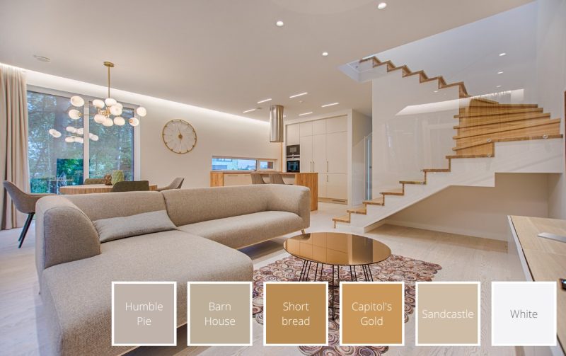
Warm neutrals — whites, greys, and browns with a tinge of yellow, orange, or red — make a space feel immediately comfortable, familiar, and inviting. This is the palette of homes that feel genuinely lived-in and welcoming, where every surface seems to wrap around you rather than stand back.
Mix warm greige and soft yellowish-brown tones with a crisp warm white on walls, furniture, and accents. The abundance of brown undertones creates a wholesome, nature-inspired feel that works effortlessly across living rooms, bedrooms, and hallways. In 2026, this palette underpins the "quiet luxury" and "warm minimalism" aesthetics that continue to dominate global interior design.
Here's what we recommend to achieve a warm, inviting neutral base: Humble Pie (NP N 3180 P) · Barn House (NP N 3190 P) · Shortbread (NP YO 2478 D) · Capitol's Gold (NP YO 1169 D) · Sandcastle (NP N 3195 P) · White (BS 00E55)
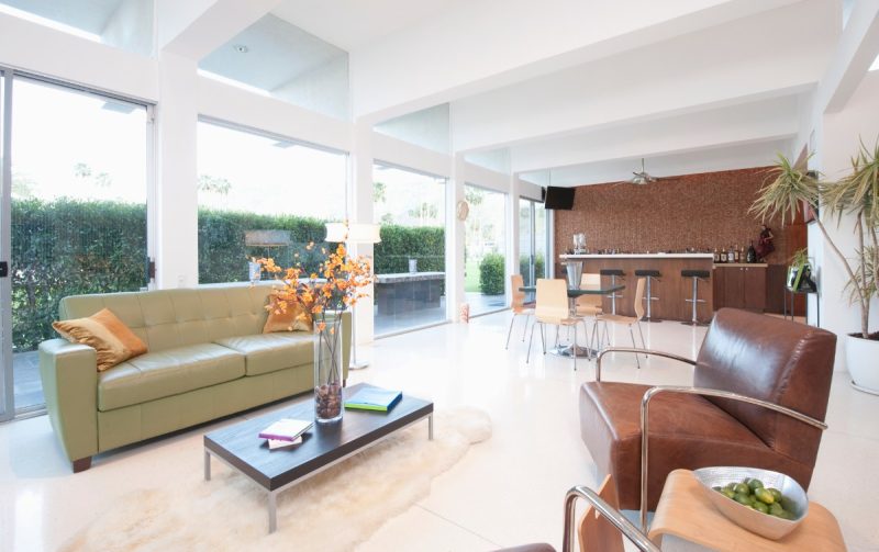
2. Brown and Beige Colour Palette
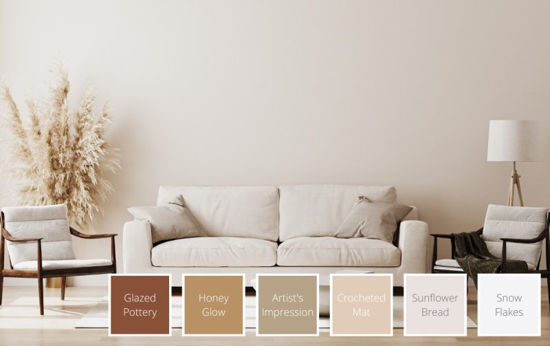
A timeless combination in both fashion and interior design, brown and beige creates a sense of calm, groundedness, and natural stability. Start with a light beige as your base to establish an airy, relaxed foundation — then layer in darker brown accents through furniture, rugs, and decorative pieces to add depth, resilience, and warmth.
This palette is one of the most comforting you can choose for a home. It's unpretentious, deeply cosy, and endlessly adaptable across different furniture styles and materials.
Create a calming, grounded sanctuary with these shades: Glazed Pottery (NP N 3166 A) · Honey Glow (9038) · Artist's Impression (NP N 1864 T) · Crocheted Mat (NP N 3163 P) · Sunflower Bread (NP N 3162 P) · Snow Flakes (1164)
3. Dark Earth Tone Palette
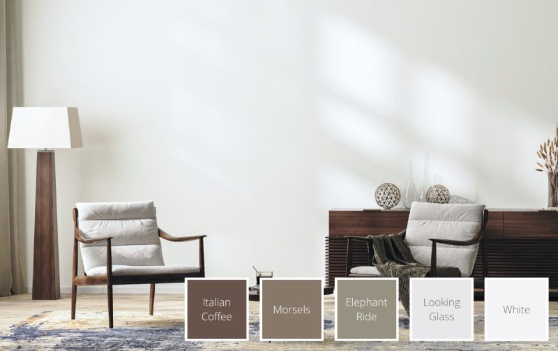
For those who want their neutral palette to have real depth and sophistication, a dark earth tone scheme is the answer. A rich dark brown forms the anchor of this palette — most effectively introduced through deep-toned wooden furniture like a TV console, dining table, or wardrobe — while warm-undertone whites on walls, cushions, and soft furnishings keep the space feeling open and breathable.
Earthy tones connect us intuitively with the natural world, which is why so many people find them deeply calming. Dark earth palettes are particularly effective in living rooms and master bedrooms where a sense of groundedness and warmth is the priority.
Add depth and sophistication to your space with these rich earth tones: Italian Coffee (NP N 3184 A) · Morsels (NP N 1863 D) · Elephant Ride (NP N 3028 T) · Looking Glass (NP OW 2156 P) · White (BS 00E55)
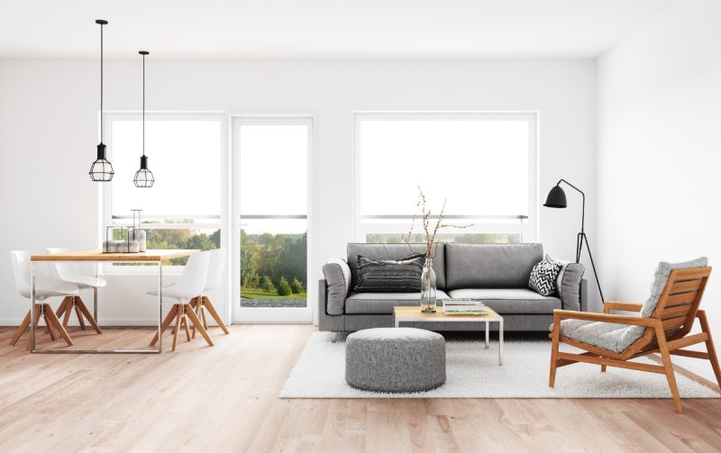
4. Monochromatic Colour Palette
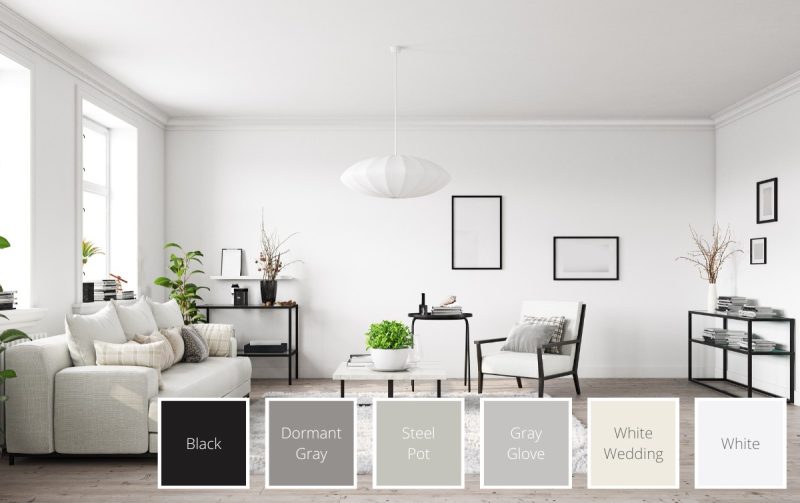
Clean, timeless, and endlessly chic — a monochromatic palette built around white, grey, and black is one of the most foolproof approaches in interior design. A predominantly white base opens up the room and brings a sense of serenity, while stark black lines in furniture frames and fixtures add graphic contrast and visual tension. Grey pieces pulled in between tie the whole composition together beautifully.
The real strength of a monochromatic palette is its receptiveness to accent pieces. A single houseplant, a colourful cushion, or a piece of artwork becomes instantly impactful against such a restrained backdrop — giving you full creative control over the room's focal point.
Achieve a clean, timeless monochromatic look with these shades: Black (BS 00E53) · Dormant Gray (NP N 2043 T) · Steel Pot (NP N 2047 P) · Gray Glove (NP N 1991 P) · White Wedding (NP OW 2206 P) · White (BS 00E55)
5. Grey Colour Palette with Warm Hues
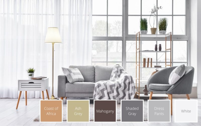
Grey is one of the most versatile neutrals available — equally at home in a modern, edgy space as in a calm, elegant one. The secret to making grey feel genuinely warm and inviting rather than cold and clinical is in what you pair it with.
Warm-hued brown furniture trimmings and accessories — think teak side tables, tan leather cushions, wooden frames — introduce exactly the right amount of cosiness against a cool grey base. The contrast is subtle but transformative, creating a palette that feels balanced, refined, and deeply liveable.
Build a cosy, timeless grey palette with these shades: Coast of Africa · Ash Grey · Mahogany · Shaded Gray · Dress Pants · White (BS 00E55)
6. Blue-Grey and Brass Palette
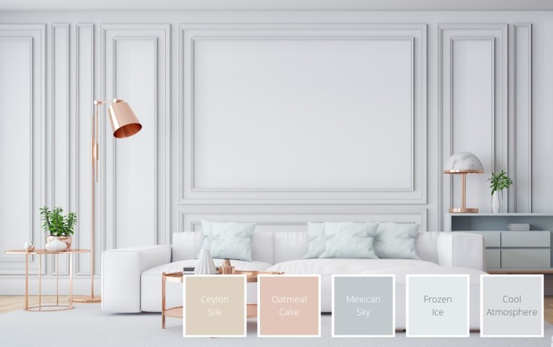
For something a little more romantic and atmospheric, a blue-grey and brass palette creates a dreamy, cloud-like quality that's difficult to achieve with any other combination. The subtle warmth of brass — in lamps, coffee tables, and fixtures — plays beautifully against the cool softness of blue-grey, introducing a touch of glamour without disrupting the palette's overall calm.
Dress the room with a white sofa as the anchor, add blue-grey cushions and accent pieces, and let sleek brass finishes catch the light. The result is a living room that feels effortlessly sophisticated. In 2026, this palette sits comfortably within the broader trend of warm metallics paired with cool, muted tones.
Create a dreamy, atmospheric space with these blue-grey shades: Ceylon Silk · Oatmeal Cake · Mexican Sky · Frozen Ice · Cool Atmosphere
7. Ivory with Warm Neutrals Colour Palette
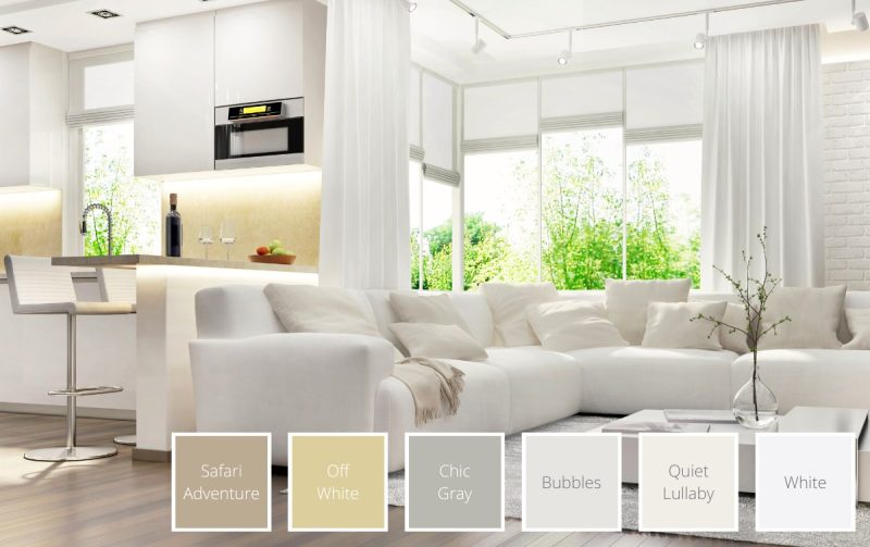
Ivory has historically been associated with luxury and quiet refinement — and for good reason. Its warm yellow undertones make it feel richer and more inviting than a pure stark white, while its neutrality allows it to work seamlessly alongside almost any other warm tone.
Pair ivory walls with warm shades of brown, grey, and beige for a palette that feels simultaneously elegant and comfortable. For a pop of character, consider a richer warm neutral on a feature wall. A houseplant's touch of green adds freshness and prevents the palette from feeling too static.
Achieve classic, luxurious warmth with these ivory and warm neutral shades: Safari Adventure · Off White · Chic Gray · Bubbles Quiet · Lullaby White
8. Pastel Neutral Tones with Metallic Colours
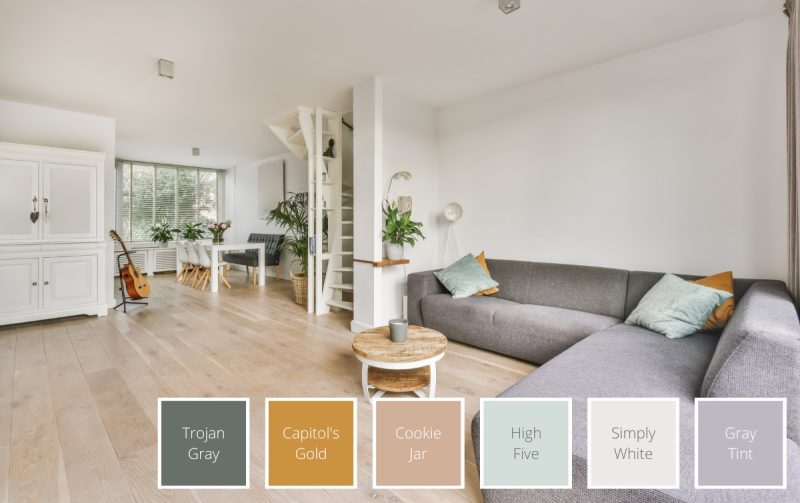
For a soft, romantic look that doesn't sacrifice visual interest, a pastel neutral palette with metallic accents is an inspired choice. Pastel neutrals bring a light, rejuvenating earthy feel to a space; metallic accents in blue-green or gold-brown add just enough glamour to make the room feel elevated and special.
Light-coloured wooden parquet flooring works beautifully with white walls and furniture as your base. A pastel grey sofa adds depth, while metallic throw pillows and accessories — used sparingly — introduce a gorgeous shine that can make even a modest room feel larger and more luxurious.
Add a soft, romantic touch to your space with these pastel neutral shades: Trojan Gray · Capitol's Gold · Cookie Jar · High Five · Simply White · Gray Tint
Benefits of Using a Neutral Colour Palette
Neutral colour palettes work well both visually and practically as they are versatile and can create a balanced and relaxing look for the home!
Creates balance
Neutral colours form a clean visual canvas, preventing any design from becoming overstimulating. They create breathing space that directs the eye towards statement pieces, accent colours, and architectural features — giving you full control over where attention lands in a room.
Creates a sense of relaxation
Muted, neutral tones are known for their calming effect on the mind. They represent a sense of visual stillness that's genuinely restorative after a day of sensory stimulation. Colours like beige and cream have an additional grounding quality — their earthy associations with wood, sand, and natural materials make spaces feel inherently safe and calm.
Versatility
Neutral palettes pair harmoniously with virtually every other colour on the spectrum — from vivid greens to deep purples. They can tie together disparate elements of a room and serve as the foundation for a wide range of interior design styles, from modern Japanese and Japandi to industrial and eclectic.
Tips for Creating a Neutral Colour Scheme
Here are some tips to help you make the most of this gorgeous colour scheme while designing your spaces!
Pair light and dark neutrals
When we talk about neutrals, what comes to mind is often a lighter variation, like tan, beige or white. However, incorporating dark neutrals like dark brown, deep gold and charcoal grey can open up a whole range of possibilities for interior design.
Dark neutrals are great at giving visual weight, especially when exploring two colour combinations for your bedroom or living room. Start with darker coloured furnishings like an armchair or coffee table, or an accent wall. Then, complete the rest of the palette with lighter walls, ceilings and floorings.
Consider the lighting in your room
The colours you choose for your room may look different under different types of lighting. Your house may get a different quality of natural light compared to another person’s. Natural light also changes as the day progresses.
Before painting a room, it’s good to test how the colour will look with the light you get in the space. Get samples of painted drywall and test them out at different timings and areas in your room to cover all bases.
You’ll want to consider your lighting fixtures as well. For example, warm-hued lighting mutes cool colours like green and blue, and makes warm colours more vivid.
Mix neutrals with bright accents
We’ve talked about the balance a neutral palette gives to a room. This is a central principle that makes neutrals pair so well with bright colours. If you’d like to make a gorgeous vivid colour pop, a neutral base is the way to go.
The muted quality of neutrals draw the eye to accents and pops of colour. They also offer a certain amount of breathing space, letting your design shine without being too overpowering.
FAQs About Neutral Colour Palettes
What are the types of neutral colours?
The different types of neutral colours include:
- Pure neutrals
These are fully saturated neutrals that don’t have an undertone. The 4 most common ones include black, white, grey and brown.
- Near neutrals
Created by mixing pure neutrals with primary colours, near neutrals have lower saturations than pure ones. For example, mixing yellow and white creates the near neutral, ivory.
- Warm and cool neutrals
Warm neutrals (e.g. beige, gold) are made by mixing a pure or near neutral with warm colours like orange, yellow or red. On the other hand, cool neutrals (e.g. blue-grey, taupe) have undertones of blue, green or purple
What neutral colours go together?
Generally, all neutrals go well together! This is especially true for colours with similar undertones (e.g. warm-undertone neutrals work well together).
More specifically, some great neutral colour pairings include:
- Beige and brown
- Dark brown and white
- Black and white
- Grey and tan
- Ivory and beige
Ready to explore the full range of Nippon Paint neutral shades? Browse thousands of colours at nipponpaint.com.sg/colours/find-your-colour/.
Related to