Introducing green into your home is one of the most rewarding design choices you can make. Symbolising tranquillity, growth, and a deep connection to the natural world, green is a colour that works in virtually every room and style — from bold and dramatic to soft and serene.
In 2026, green continues to dominate global interior design trends. Forest green, sage, and olive are among the most searched paint colours worldwide, driven by the rise of biophilic design — the increasingly popular movement to bring nature indoors as a way of improving mental well-being and creating restorative home environments.
Whether you're drawn to rich jewel tones or barely-there muted pastels, there's a green palette that's perfect for your space. Here are nine design ideas to get you started, complete with Nippon Paint colour recommendations for each look.
9 Green Colour Palette Ideas for Your Home
Choosing other colours to go with such a versatile colour as green can be a challenge; we’ve all been there. This is particularly true if you’re only at the start of your design journey.
So we’ve pulled together some of the more common colour palettes for green to give you a place to start. Use these as stepping stones to build the right colour palette for your home.
1. Bold Green with Contrasting Colours
For those who want their home to make a statement, pairing a bold green with contrasting warm tones is a highly effective approach. Cool, saturated greens juxtaposed with warm yellows and oranges — introduced through furniture, rugs, or accent pieces — create a dynamic, energetic interior that feels both confident and cohesive.
The key to making this work is balance: let the green anchor the walls and allow the warm accents to add personality without overwhelming the space.
Here's what we recommend for a bold, high-contrast green palette: Bamboo Tile (NP BGG 2641 D) · Sunken Forest (NP BGG 2635 D)
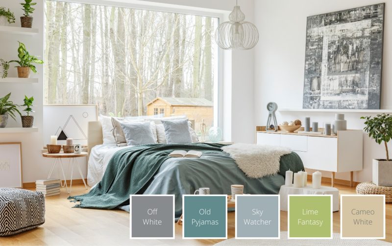
2. Blue and Green Colour Palette
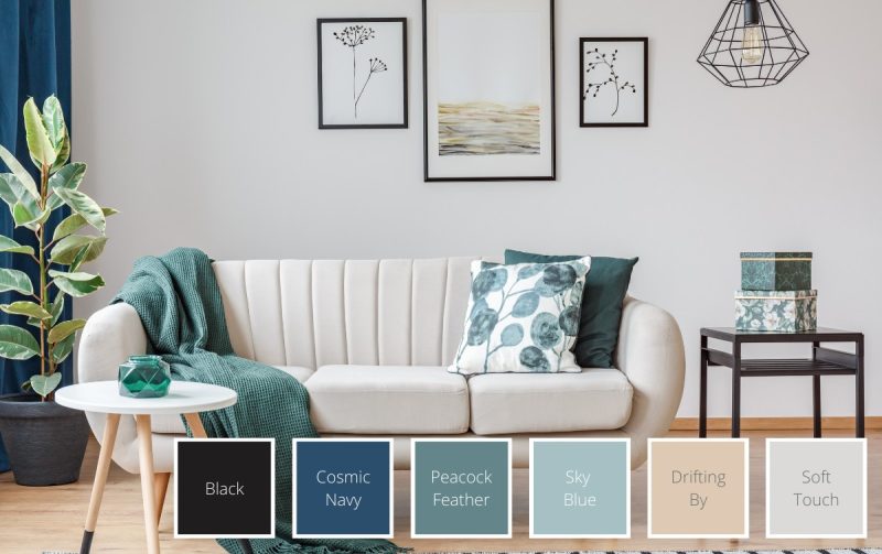
Blue and green are natural companions — neighbouring colours on the colour wheel that bring out the best in each other. Deep, rich tones of both colours can coexist in a light, airy room when grounded by muted earthy neutrals or pale greys, creams, and whites.
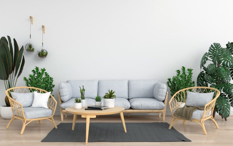
A predominantly grey or white room with blue and green accents — through soft furnishings, plants, and artwork — adds depth, visual interest, and a genuinely soothing quality that's well suited to living rooms and bedrooms alike.
Bring the blue and green combination to life with these shades: Aquarine (0812) · Elves Green (NP BGG 1608 P)
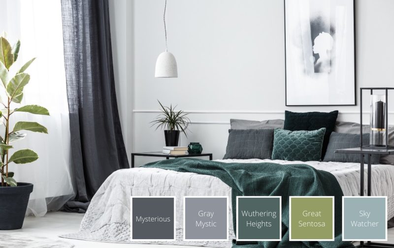
3. Forest Green and Deep Blue Colour Palette
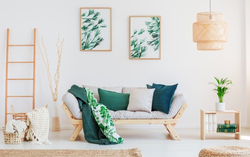
For those who love richer, more saturated hues, a forest green and deep blue combination creates an interior that feels enveloping and dramatic. These deeper tones are excellent for making a space feel cosy and intimate — ideal for a bedroom or a smaller living room where you want the walls to wrap around you.
Used as primary wall colours rather than accents, this palette creates a bold, jewel-toned atmosphere that feels luxurious and deeply considered.
Create a rich, cosy space with these deep, saturated tones: Sunken Forest (NP BGG 2635 D) · Ripe Kiwi (NP BGG 2598 A)
4. Modern Emerald Green Palette
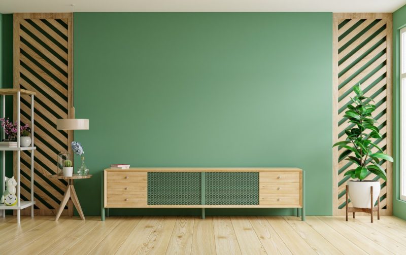
Emerald green is a modern, elegant, and timeless choice that commands attention wherever it appears. Rich and visually arresting, it works equally well as a primary wall colour or as a bold accent in an otherwise neutral room.
Earthy tones pair most harmoniously with emerald, and metallic accents — either silver or gold — bring out its natural elegance beautifully. In 2026, emerald remains one of the most popular jewel-toned paint choices globally, a fixture of the "quiet luxury" interior aesthetic.
Achieve a modern, elegant emerald look with these shades: Emerald (9048) · Ultra Green (NP BGG 1610 A)
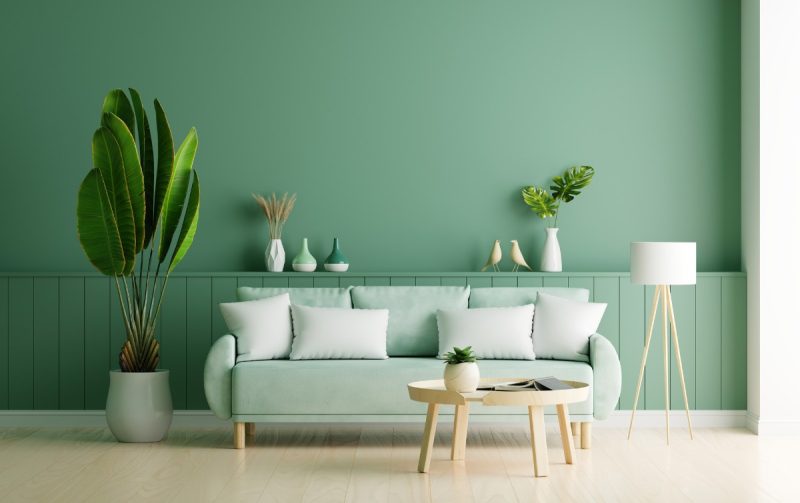
5. Pastel Green with Muted Colours
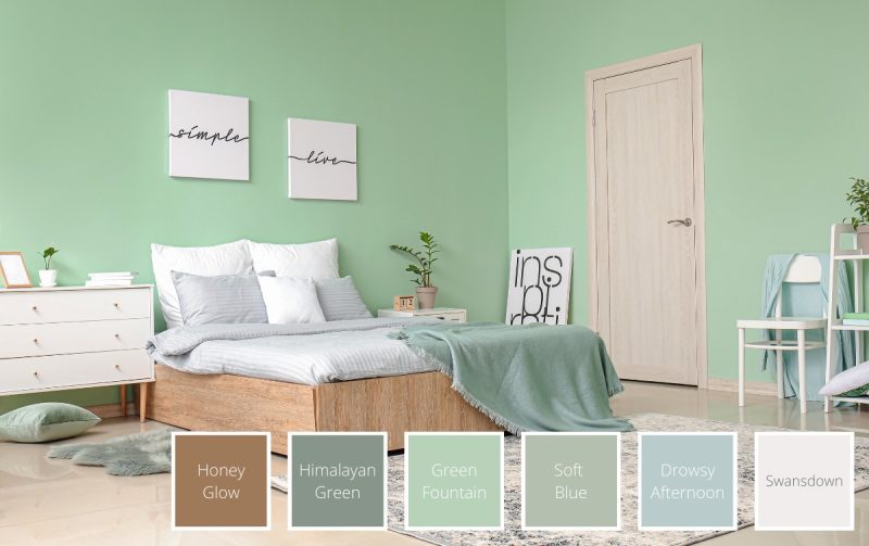
A pastel green paired with soft, muted tones creates a gently relaxing environment — particularly well suited to children's rooms, teen bedrooms, and any space where calm is the priority. In well-lit rooms, the lighter hues reflect natural light beautifully, making the space feel fresh and open.
Pastel greens also work surprisingly well in industrial or loft-style spaces with heavier furniture and raw materials — their softness provides balance and visual relief against harder textures.
Add a calming, delicate touch to your space with these pastel greens: Elves Green (NP BGG 1608 P) · Young Lime (NP BGG 2570 P)
6. Apple Green for a Pop of Colour
Apple green is one of the more vibrant and challenging greens to work with — but when handled well, the results are striking. The trick is to offset its crispness with warm neutrals that mellow the brightness and integrate it naturally into the space.
In kitchens particularly, an apple green accent wall or green accessories inject a much-needed dose of zest and energy. It's a bold choice that brings genuine personality to a room without requiring a full commitment to the colour throughout.
Inject a pop of fresh, lively green into your home with these shades: Chameleon (NP BGG 1798 T) · Natural Touch (NP BGG 1716 D)
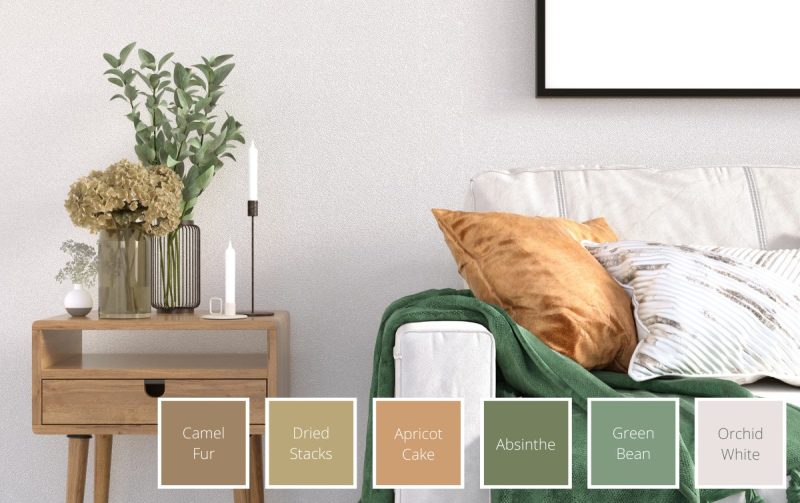
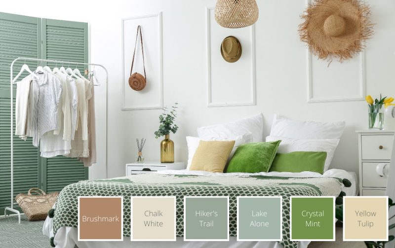
7. Green and Neutral Colour Palette
Green is one of the most natural fits for a neutral colour scheme — it adds visual interest and warmth without disrupting the calm, balanced quality of a neutral palette. A pop of lime green or a touch of deeper, cooler green can elevate a minimalist Scandinavian scheme with ease, or add an old-world refinement to a muted, elegant space.
A single green furniture piece — a sofa, an armchair, or a side table — can also create a compelling focal point in an otherwise neutral room without requiring a single drop of paint.
Elevate your neutral palette with these versatile green tones: Sage Mist (NP BGG 1715 T) · Ripe Kiwi (NP BGG 2598 A)
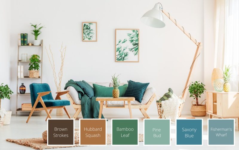
8. Rustic Green Colour Palette
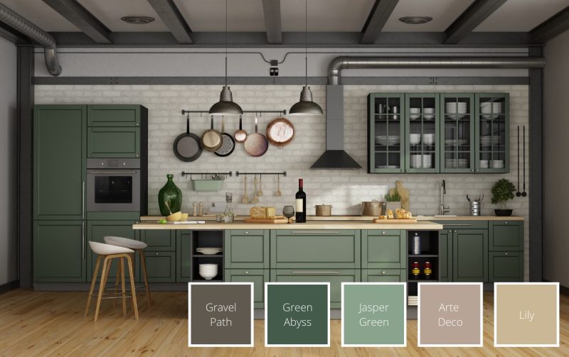
Rustic interiors celebrate natural textures — stone, exposed wood, terracotta, plants — and a carefully chosen green can anchor and enhance all of these elements beautifully. Deeper, more saturated greens like moss or forest green are the best fit here, providing the visual weight needed to balance the richness of natural materials.
Softer pastels tend to get lost against the warmth of rustic textures, so reach for deeper tones that feel genuinely grounded. In 2026, rustic green palettes pair particularly well with handcrafted ceramics, woven rattan, and warm-toned wood furniture.
Ground your rustic space with these deep, earthy greens: Sunken Forest (NP BGG 2635 D) · Natural Touch (NP BGG 1716 D)
9. Sage Green and Yellow Palette
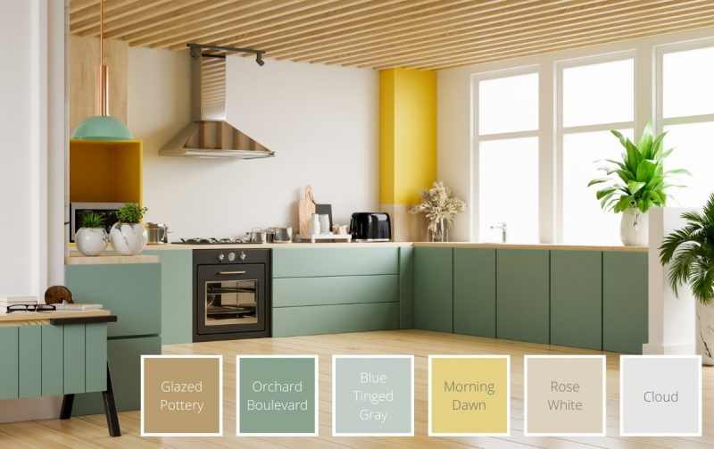
Sage green is one of the most consistently popular interior colours of recent years — and in 2026, it shows no signs of fading. Its cool, grey-tinged quality means it functions almost as a neutral, sitting comfortably alongside whites, creams, and warm tones alike.
Pairing sage with a contrasting, summery yellow creates a combination that feels simultaneously grounded and uplifting — earthy and optimistic in equal measure. It's an especially effective palette for kitchens, breakfast nooks, and any space where you want a mood lift without bold drama.
Create a fresh, balanced palette with these sage and complementary shades: Sage Mist (NP BGG 1715 T) · Chameleon (NP BGG 1798 T)
Benefits of Using Green in Your Home
Colour psychology can be an important part of how we feel in our home. The colours we choose can directly impact how happy, healthy, relaxed, social or creative we feel. And who doesn’t want to feel relaxed in their home?
Green can help our mental state in a few ways, beyond how much we like the space we’re living in. Here are some benefits of a green colour palette.
Creates a calming environment
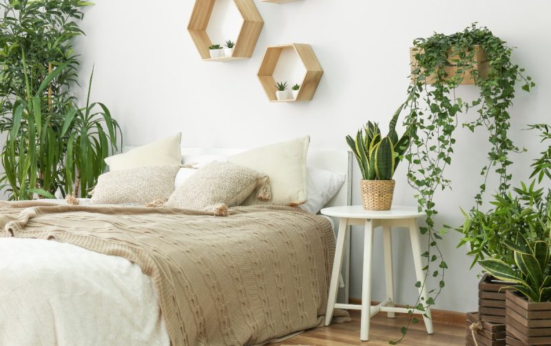
Colour can have a considerable impact on our moods, and green is no different. Scientists think green may be instinctually connected to safety for humans, which is why so many find it calming. Shades of green can help put people at ease in new places.
So if you’re looking for a new colour to put in your bedroom, consider green, as it may be the final step to creating your home oasis.
Boosts creativity and productivity
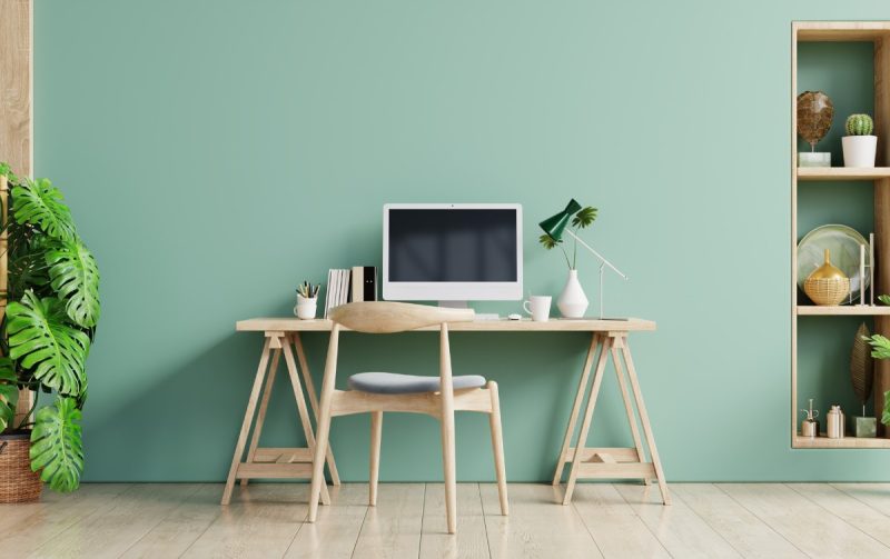
Green is also linked to creativity. Again, scientists think this is, in part, an instinctual positive association. It’s also reinforced in our community, where we “give the green light” to move forward with a new project.
For this reason, amongst others, consider green when creating or redoing an office or creative space. The natural inclination to include plants is a good idea, too.
If you’re looking for a quiet, productive space, consider a light shade of green. Add a bright pop of saturated colour for a touch of joyous energy.
Expert Tips for a Green Colour Scheme
Green is a versatile colour and can sit well with pretty much every type of colour scheme and style. It’s only a part of the equation though, so in this section we’ll share interior design tips that should help you incorporate green into your home seamlessly.
Match greens with other cool colours
Along with the complementary colours of green and blue, consider adding purple in the mix. Because they are all next to each other on the colour wheel, you can experiment mixing and matching saturation, hue and value (how much white or black is in the colour) without fear of clashing.
If you have a dimly lit bedroom, rather than choosing white, consider choosing a saturated mid-tone. The cool range of blues, greens and purples is a spot-on choice to help brighten up spaces with little natural light.
Darker, more saturated tones are often a good choice if you’re looking to create a cosier space.
Keep it simple with neutral colours
Because green is so synonymous with the outdoors, some interior designers actually use green as a neutral colour. So if you’re looking for a timeless and elegant space, consider adding green accessories to your neutral palette. It shouldn’t be too much of a shock to the eye, and will add that visual interest to help the room feel fresh and balanced.
Adding green into an otherwise neutral palette of greys, whites or browns can also break up the space.
Use it on an accent wall
There are many ways to create visual rhythm or break up spaces in a room — and one of those options is a feature wall. For example, if your living space and your work space are in the same room, consider using a green accent wall to create that separation. This will visually show that your workspace is a different “room”.
Accent walls are also a place in your home to showcase your creativity and perspective. It’s a good way to add some texture, ombre, or another feature element.
Consider Feng Shui
In Feng Shui, green plays a pivotal role in creating a balanced home. It’s a wood element and regardless of how much or little of the colour you use in your space, green brings good energy. It’s also associated with personal and financial growth as it encourages breakthroughs.
Green is an ideal colour to include in the kitchen to encourage strong family ties. It’s also something to consider softly including in a child’s bedroom to encourage proper development. The bathroom, where we cleanse and rejuvenate, is also a good place to consider the balancing energy of wood to promote clarity.
The Timeless Versatility of Green
Few colours offer the range and flexibility of green. Calming or energising, bold or subtle, warm or cool — there's a shade of green that's right for every room, every style, and every homeowner.
Ready to find yours? Explore Nippon Paint's full range of green shades and thousands of other colours at nipponpaint.com.sg/colours/find-your-colour/.
Related to